
Enterprise
Design Systems
The Spot platform includes multiple SaaS product suites managed by design teams in the United States and Israel. A solid design system is required to ensure continuity across the platform.
Role:
System design collaborator
Component design
Accessibility audit
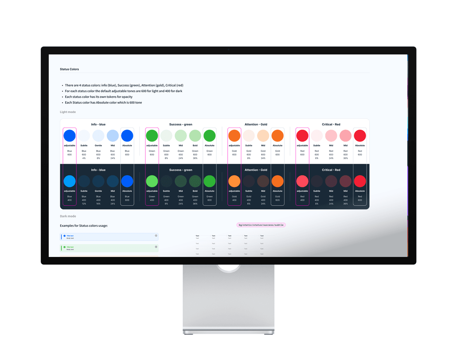
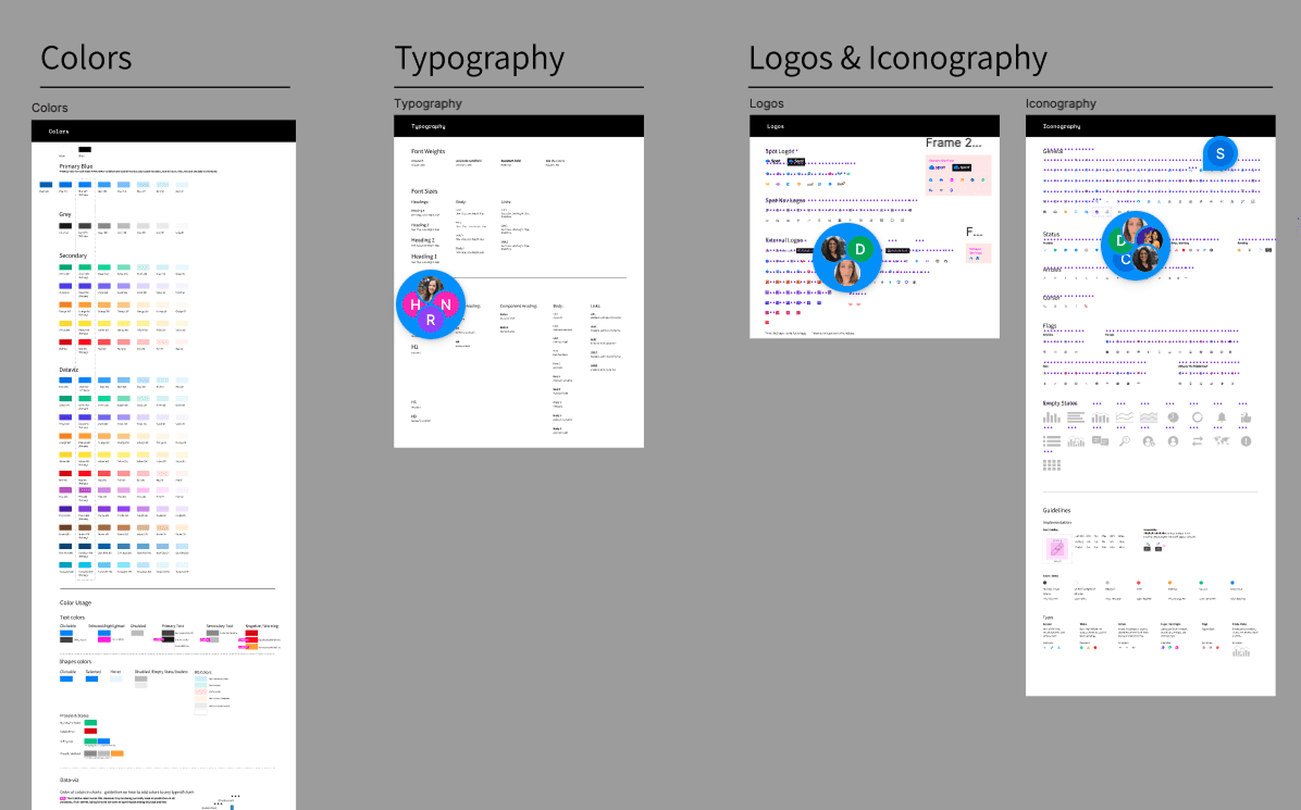
Figma-built style guide
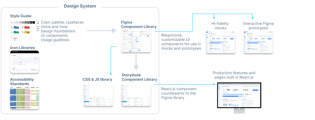
The atomic-structured style guide was deployed in Figma, exclusively for the design which is why we used Figma as opposed to an HTML-based system. Storybook provides the React component equivalents for the dev teams. This living style guide serves as a reference for designers as well as the 'mother ship' that drives the Figma component library. Design leads can update an element here and all components that use that element will be automatically updated, ensuring all mocks remain up to date.
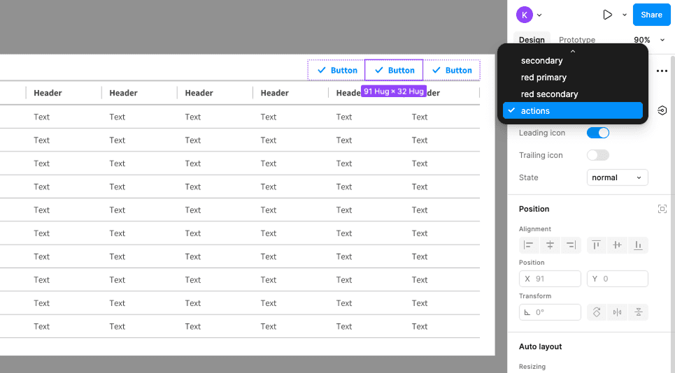
Robust Figma component library
All components listed in the style guide are exported as functioning Figma components available as a Figma component library. This process allows designers to build mocks using Lego-like components, while ensuring any style updates are automatically applied.
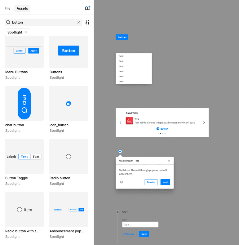
Auto-layout and nested variants
All components are responsive and can be resized without requiring the content to be reformatted. Additionally, every element in a component has nested variants allowing the designer to quickly set the type or state of a button, or even change the content of a table cell from text to icons or an input. All variant combinations are pulled from the latest updated Figma library, eliminating the need for the designer to interrupt their workflow to check style guide specs. This system has sped up prototyping exponentially.


The heart of this scalable system is the robust Figma component library
The powerful Figma component library not only slashes iteration time but ensures pixel-perfect precision of our mocks, empowering the teams to focus on creativity rather than repetitive tweaks. With this system, scalability and consistency become second nature, transforming complex business needs into fast efficient Figmock creation.
up to
75%
faster